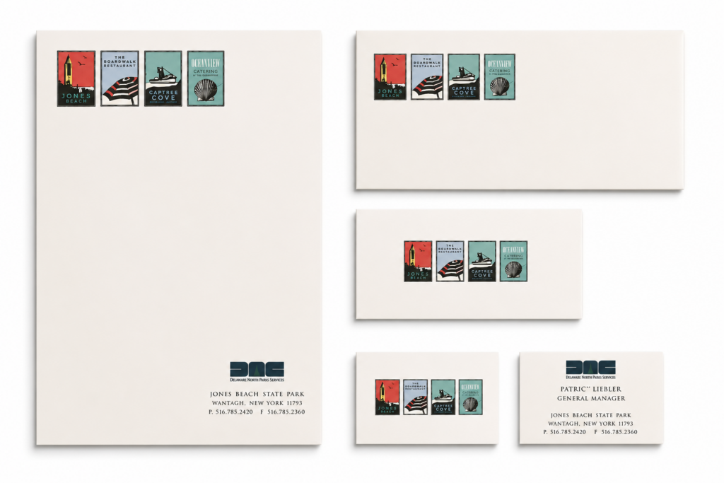
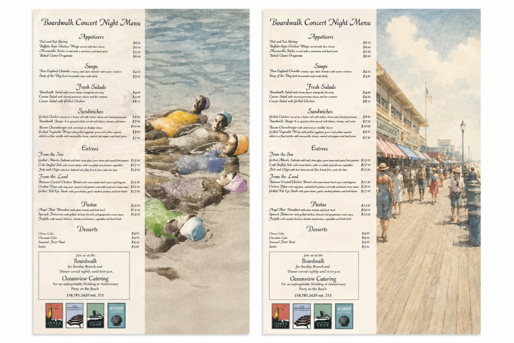
The Identity system for Jones Beach pulls in four separate logos to form a system for the park and boardwalk restaurant. The menus below were created from archival photography and hand colored for a vintage inspired feel. The logos were created in Illustrator with a complimentary color palett.
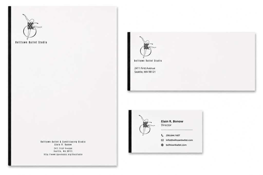
Beletown Ballet Identity System
Logo and identity system for a ballet studio created in Illustrator. The logo was first sketched out in pencil then brought into Illustrator to clean up and vectorize. This is a very old logo so I don’t recall my font choices but kept it clean and minimal for a light and modern system.
Video Production Company Logo
Logo design for a production company focusing on skating and snowboarding videography. The idea started from sketches and was further refined in Illustrator.
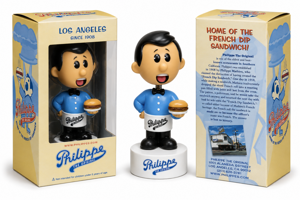
Iconic Restaurant Logo
Philippe Restaurant in Los Angeles is an iconic “home of the french dip” brand. I created a redesign for them in 2003 and designed a Funko character around the logo.
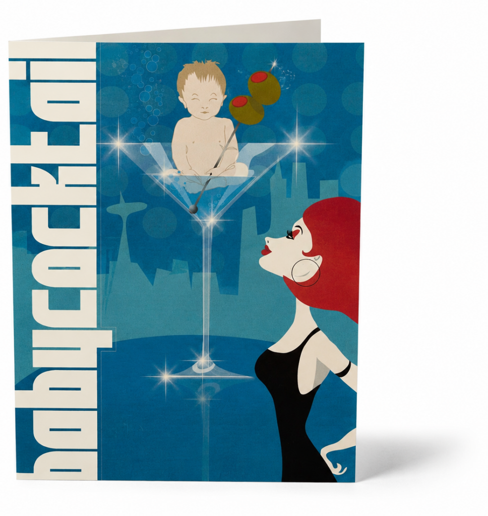
Invitation Illustration
Created a custom illustration for a baby shower invitation that reimagined the traditional shower as a stylish cocktail party celebration. Developed in Adobe Illustrator, the artwork combined mid-century lounge aesthetics with playful storytelling, featuring a baby perched inside a martini glass while an elegant hostess looks on.
The illustration was designed to capture the hosts’ sense of humor and create a memorable, sophisticated alternative to conventional baby shower graphics. Inspired by retro cocktail culture, the piece blended clean vector shapes and a bold color palette to create a distinctive visual identity for the event.
The final artwork was adapted across both printed invitations and digital evites, ensuring a cohesive experience across formats while maintaining the charm and personality of the original illustration.
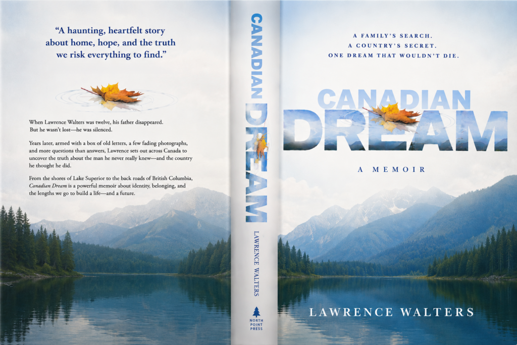
Book Jacket & Title Treatment
I like this title treatment designed for a book my Dad wrote. He actually wrote five books and self published two. I designed all of his book jackets and he usually had pretty explicit visual direction but this one he let me play with. The dreamlike leaf falling into the reflection of water was a metaphor for how he felt growing up, disconnected and adrift. The next one turned out a bit different but I can’t find the final version right now so posting this draft.